Until now, the Pixel brand was all about Chrome OS laptops.
But in September, the company surprised us all when it announced its Surface competitor, the 10.2-inch Pixel C Android tablet with its optional Bluetooth keyboard. Unlike its Nexus line of tablets, this is the first time Google has built its own tablet.
If you’re willing to pay the price — starting at $499 for the 32GB model plus another $149 for the keyboard — the Pixel C is a very nice, solid tablet that sits atop the current crop of Android tablets. At that price, it directly competes with the iPad Air 2 (though the basic model of the Air only comes with 32GB of storage space).
With the keyboard, it also makes for a surprisingly productive laptop replacement, though that depends a bit on your personal needs. At that price, though, you could also get a relatively decent laptop without having to make the kind of tradeoffs that come with using Android with a keyboard.

The Pixel C is now available in the Google Play store in a select number of countries. You can now buy it in the U.S., Canada, Germany, Ireland, Austria, Australia, New Zealand, Hong Kong, France, Spain, Belgium, Netherlands and Switzerland.
If you think this tablet/keyboard combo sounds a little bit like a Microsoft Surface, or maybe even Apple’s iPad Pro with a keyboard, you’re not alone. It’s impossible not to compare the C with them. While Microsoft’s Surface is essentially a fully featured laptop with a detachable keyboard, Google and Apple are opting for a combination of a tablet and mobile operating system with a keyboard.
But let’s not get hung up on this. It’s worth looking at the Pixel C as its own device first.
The Tablet
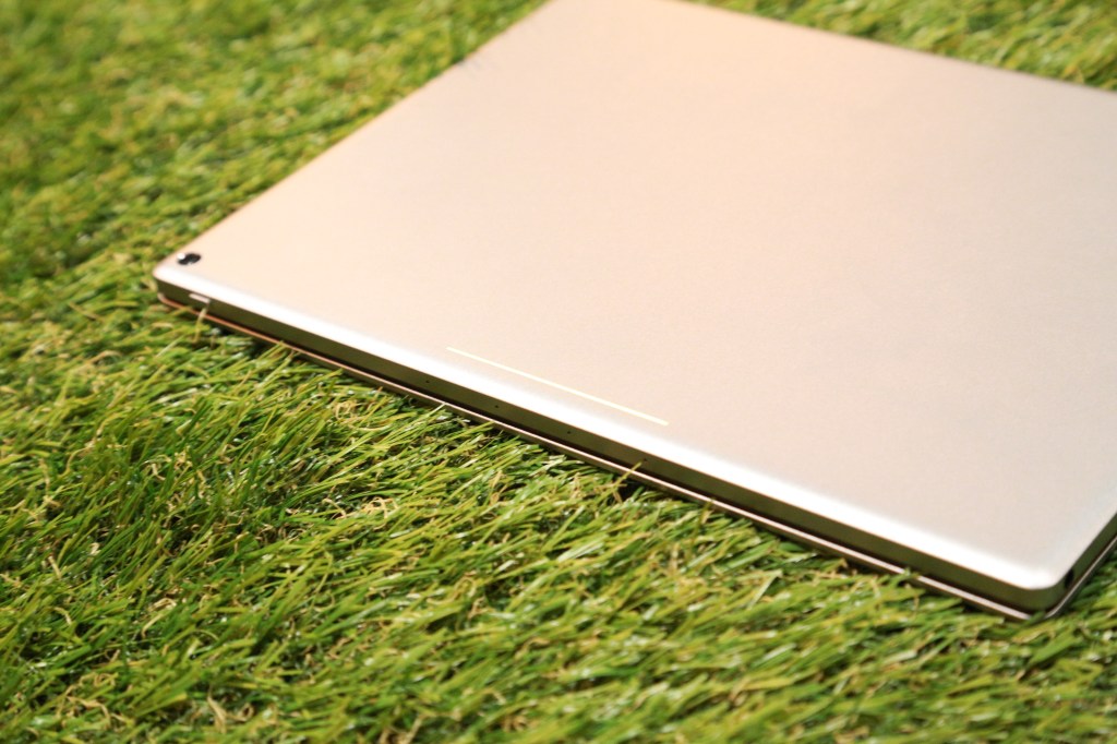
The Pixel C tablet, with its aluminum shell and brushed metal look, feels like a high-end machine. With the keyboard attached, it looks as if somebody shrunk a Pixel laptop down to tablet size – down to the light strip on top of the tablet and the plastic nubs on the bottom of the keyboard, which look exactly like those on the Pixel Chromebook.
This is a solid build if there ever was one. You pay a bit of a price for that, though. At half a kilo (or 1.1 pounds for those of you who haven’t gone metric yet), the Pixel C tablet doesn’t feel heavy, but it’s not exactly lightweight either. Add another 399 grams for the keyboard and you end up with a somewhat hefty combo.

The Pixel brand has always been about the screen and the C is no exception. Once you turn the tablet on, ignoring the keyboard for now, the first thing you’ll notice is the screen. It features a 10-inch, 2560×1800 resolution screen (that works out to a nice 306 pixels per inch), with a 1500:1 contrast ratio.
It’s a beautiful screen. It’s also one of the brightest screens I’ve seen on a tablet. It’s actually so bright, it’ll hurt your eyes when you look at it with the brightness cranked up all the way. Despite all of this, Google says it still managed to keep energy consumption low.
The screen has a bit of an unusual aspect ratio. One to the square root of two — that’s the same as the European A4 paper size. Especially in landscape mode, that feels like a really good ratio for browsing the web and working on documents. With this ratio, you could split the screen in half and still get the same ratio again (only switching from landscape to portrait). That would be ideal for a split-screen view, but while this feature made a short appearance in some of the Marshmallow betas, it didn’t make it into the final release.
As for the C’s performance, there are no surprises here. Nobody is going to call it a slouch. With its Nvidia Tegra K1 and 3GB of RAM, everything works just as smoothly as you would expect it to.
![]()
Just like all of Google’s newest devices, the C uses a USB Type C port for charging. Google says the battery should last a good 10 hours and while we haven’t done any formal tests yet, that number does sound about right.
The C comes with the latest version of Android Marshmallow and it’s pretty much a standard build. The only difference I noticed is that the home and back buttons are on the bottom-left side, with the task switcher on the right.
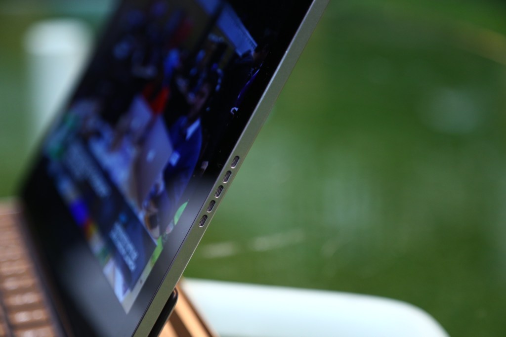
To see how Google likes to go a little bit overboard with the Pixel line, just look at the four microphones it built into the tablet — all of that just to make sure it can hear your “OK Google” commands. The speakers, on the other hand, are loud enough, but won’t blow you away.

The Keyboard
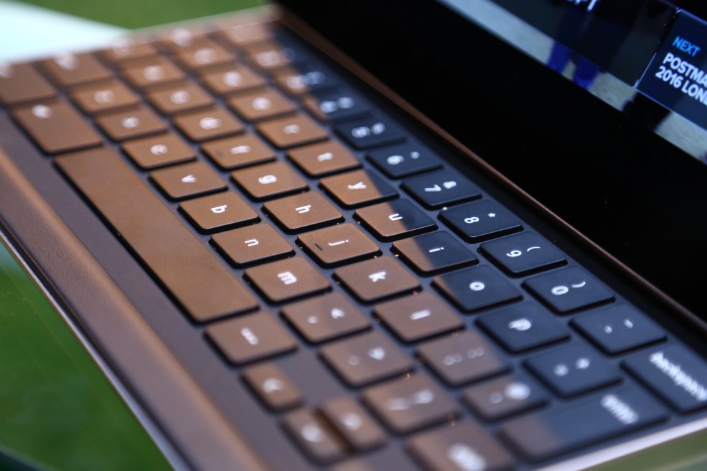
At $149, you’re allowed to expect quite a bit from the keyboard. It’s small but after a few days of using it, it’s grown on me. The keys are a bit shallower than I’d like, but it’s quite usable overall. I have the same complaint about most chicklet-style keyboards, and except for their size, Google’s keys here aren’t actually all that different from those on an Apple keyboard.
Surprisingly, even the extra small ‘tab’ and ‘return’ keys work just fine in daily use. For the most part, though, Google kept the most-often-used keys at a regular size.
The defining feature of the Pixel C/keyboard combination is how you attach them. Unlike on the Surface, there is no hinge on the tablet itself. Instead, it’s on the keyboard. You simply align the tablet with the keyboard and they’ll click together. All of this is held together with magnets. And those magnets are strong. I’ve stuck the C on a metal door to test them and there was no way it was going to drop. Similarly, I never worried about the tablet accidentally detaching from the keyboard.
The keyboard and tablet connect over Bluetooth, so there are no connectors, and the keyboard charges inductively from your tablet when the two are attached. That means you never have to worry about charging it.
It’s also pretty satisfying to smash the combo over your knee to disconnect the tablet from the keyboard.
Is It Any Good?
The tablet/keyboard combo makes more sense than I first expected — and I’ll admit that I never used an Android tablet with a keyboard before.
I used the C as my main machine over the last few days and was able to pretty much do everything I needed to work. What’s missing is a split-screen view in Android and that’s a shame, given that the screen would be perfect for that.
There is a market for the C, but I think it’ll be a small one. The Pixel Chromebooks were meant to show what you can build when you don’t cut corners to keep the price down — the C is meant to showcase what that would look like for a high-end Android productivity tablet. It’s the Android Tablet for the CEO — assuming your CEO uses Android.


Comments are closed.